

Picture this: a cozy living room painted in a deep, rich hue that evokes tranquility and sophistication. The walls, adorned with art that pops against the color, create an ambiance that feels unique and inviting. As homeowners increasingly seek to express their individuality, obscure colors are emerging as a popular choice in interior design. These unconventional shades can transform spaces, offering a fresh perspective on traditional color palettes. This article will explore the rise of obscure colors in home design, their psychological impacts, and practical applications, backed by statistics and insights from industry experts.
Understanding Obscure Colors
Obscure colors, often defined as hues that fall outside the typical color spectrum seen in most homes, include muted shades, deep tones, and unconventional combinations. While many homeowners gravitate toward safe neutrals like beige and gray, others are venturing into uncharted territory with colors such as deep teal, burnt sienna, and muted mustard. These choices can breathe new life into a space, reflecting the homeowner’s personality and lifestyle.
The Psychology of Color in Home Design
Color plays a significant role in shaping our emotions and perceptions. According to color psychology, different hues can elicit various feelings and responses. For example, blue is often associated with calmness and serenity, while yellow can evoke happiness and energy. Obscure colors can amplify these effects, creating unique and inviting atmospheres.
Emotional Impact of Obscure Colors
- Deep Greens: Often reminiscent of nature, deep green shades can instill a sense of balance and tranquility. A study by the University of Texas found that green environments can significantly reduce stress and enhance mood.
- Muted Blues: Shades like dusty blue or slate evoke calmness and sophistication, making them ideal for bedrooms and meditation spaces.
- Rich Earthy Tones: Colors such as terracotta and rust can create warmth and comfort, providing a cozy backdrop for family gatherings.
The Rise of Obscure Colors in Interior Design
According to the 2023 “Interior Color Trends” report by the National Painting Contractors Association, homeowners have been using obscure colors more frequently. The report indicated that 67% of surveyed homeowners expressed interest in using non-traditional colors for their living spaces. This shift reflects a growing desire for personalization and a break from conventional design norms.
Popular Obscure Colors and Their Applications
- Deep Teal: This striking hue is perfect for accent walls or furniture. It pairs beautifully with warm wood tones and metallic finishes, making it versatile for modern and traditional settings.
- Burnt Sienna: This earthy shade adds warmth and depth to rooms. It’s particularly effective in dining areas, creating an inviting gathering atmosphere.
- Muted Mustard: A bold choice, muted mustard can be used in kitchens and living rooms to add a pop of color without overwhelming the space. Its vintage vibe pairs well with retro or mid-century decor.
- Slate Gray: While gray is a common choice, slate gray offers a more profound, decadent alternative. It works well in modern spaces, adding elegance and sophistication.
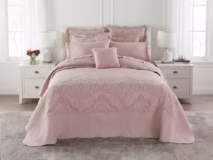
- Dusty Rose: This soft, muted pink can bring a romantic touch to bedrooms and living areas. It complements other pastel colors and can create a serene environment.
The Practical Side of Choosing Obscure Colors
While the aesthetic appeal of obscure colors is evident, practical considerations also come into play. Homeowners often worry about the longevity of their color choices, particularly when opting for bold or unconventional hues. Here are a few practical tips:
Consider the Lighting
Lighting significantly impacts how colors appear in a space. Natural light can enhance the vibrancy of obscure colors, while artificial lighting may alter their appearance. It’s essential to test colors in different lighting conditions before deciding.
Choose the Right Finish
The finish of paint can affect the overall look of a color. Matte finishes can soften obscure colors, while glossy finishes amplify their intensity. Homeowners should choose finishes that align with their desired ambiance.
Start Small
For those hesitant to commit to painting an entire room an obscure color, starting small can be an effective strategy. Consider accent walls, furniture pieces, or decorative accessories in these colors to introduce them gradually.
Success Stories: Transforming Spaces with Obscure Colors
Many homeowners have successfully transformed their spaces by embracing obscure colors. For instance, a couple in Portland, Oregon, decided to paint their dining room a deep teal, complemented by white trim and warm wood furniture. The result was a stunning space that felt both inviting and elegant. Their interior designer said, “The deep color not only made the room feel more cohesive but also created a beautiful backdrop for their art collection.”
Another homeowner in Austin, Texas, opted for a burnt sienna accent wall in her living room, paired with muted mustard and dusty rose decor. She noted, “The colors brought a warmth to the space that I didn’t realize was missing. It feels like home now.”
Conclusion
The rise of obscure colors in home design reflects a broader trend toward personalization and self-expression. As homeowners increasingly seek unique ways to showcase their personalities, these unconventional shades provide an opportunity to create inviting and visually striking spaces. Homeowners can embark on a journey of creativity and style in their living spaces by understanding the psychological impacts, practical applications, and transformative potential of obscure colors. Embrace the obscure—your home will thank you.